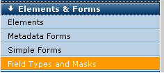
To access this option, expand Elements & Forms in the left panel of the Site Administration Dashboard and click Field Types and Masks.
Out of the box CommonSpot provides more than a dozen field types for use in creating Custom Elements, Simple Forms, and Metadata Forms. CommonSpot includes commonly used field types such as popup calendars, text areas, selection lists, checkboxes, radio buttons, large text blocks, images, formatted text blocks. The multimedia field type enables the easy addition of locally or externally hosted video, audio, or other multimedia to forms.
You can also build your own custom field types. To create new fields, choose Add New Field in Custom Element Field Definitions and other dialogs that enable creating or editing fields.
Links in the table below contain specifics on completing Other Properties for that type.
For additional information on creating text fields, see Text Handling in CommonSpot and the Data Type description in Add Field Type.
Note regarding the Cookie Field attribute: Custom field types that support the Cookie Field attribute and submit values in an HTML input field of type 'hidden', must also add the HTML attribute 'cs_saveCookieValue' to that hidden field. This attribute is required in order for its value to be saved into a cookie when submitted. You do not need to add a value to the 'cs_saveCookieValue' attribute.
|
Field Type |
Description |
|
Calendar |
Renders a pop-up calendar. Remember to set the date/time format in the Other Properties tab. |
|
Checkbox |
Renders a standard checkbox. |
| Color Picker | Renders a color selector with options to populate a custom color pallette. You can optionally define a default color and set focus to this field. |
CommonSpot Extended URL |
Invokes the CommonSpot Insert Link dialog, which can be optionally configured to limit or extend link types requested in a Custom Element. See the Insert Link description in the Contributor's Reference. Note: Anonymous users cannot run this field outside the dashboard. |
|
Date |
Renders an edit control for the input of a date. |
|
|
Renders an edit control for the input of an email address. Includes a cookie field in other properties. |
|
Formatted Text Block |
Renders the rich text control allowing the user to enter and format text as if using the Formatted Text Block Element. Fields of type Formatted Text Block are intended for formatted HTML. Formatting is passed through so that the content is rendered according to the formatting entered. |
|
Hidden |
A field that does not render but can be used to provide defaulted data. |
|
Image |
Renders a field allowing the user to upload or specify an image. You can enable alternate locations for uploading images. Note: Anonymous users cannot run this field outside the dashboard. |
|
Large Text Area |
Renders a text area control that is unlimited in size. Fields of type text are intended for text only. HTML entered in such fields is escaped in order to display the HTML codes. See Text Handling in CommonSpot. |
|
Line Break |
Renders one or more line breaks. Set the number of line breaks in the Other Properties tab. |
|
Multiple Checkboxes |
Renders a list of values, each of which can be checked. |
|
Multimedia |
Renders options for selecting available local or externally hosted multimedia, when configured. See Multimedia Services. |
|
Number (float) |
Renders an input field for numbers (accepts decimal values). |
|
Number (integer) |
Renders an input field for numbers (accepts integer values). |
|
Radio Buttons |
Renders a list of values, only one of which can be selected. |
|
Section Label |
Renders a label for a section within your form. Optionally use the Other tab to select an HTML tag for a label. |
| Section Text | Allows you to render simple or formatted text via a form field. Add formatted text to a form from the Other tab, using the RTE. |
|
Renders a dropdown list or a list box, depending on the size specified. The contents of the list can be specified directly, generated from a custom query, or the list of CommonSpot User Groups. See Option List Source below. |
|
|
Small Text Area |
Renders a text area control that is limited to 255 characters. Fields of type text are intended for text only. HTML entered in such fields is escaped in order to display the HTML codes. See Text Handling in CommonSpot. |
|
Taxonomy Browser |
Renders a browser for selecting one or more terms from the imported taxonomy. Different views are provided to find the appropriate term. |
|
Text |
Renders a standard edit control. Fields of type text are intended for text only. HTML entered in such fields is escaped in order to display the HTML codes. See Text Handling in CommonSpot. |
|
Tree Control |
Renders a control allowing the user to pick from a list of items in a tree structure. |
|
URL |
Renders a live link. |
Developers or site administrators can also create and register custom field types and define one or more Field Masks - small ColdFusion scripts, similar to Custom Render Handlers, for controlling field display on output.
Use this dialog to register and manage both Field Masks and Custom Field Types. You can modify settings for a defined mask, add a new one, or create and manage custom field types. Use the Field Types dropdown to filter for Standard or Custom Field Types. The Standard Field Types view displays all field types allowed by default in a Display Template. The Custom Field Types view is populated once new Custom Field Types are added.
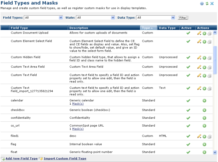
Once one or more Field Masks are registered for a Field Type, the Description column displays the new Field Masks, as shown above for the calendar and cs_url field types. Selecting the Mask(s) link displays the Field Masks dialog.
Creating a new Field Mask or editing an existing one is a simple matter of giving it a name and other basic information, and then selecting the code files for the Input and Output modules respectively.
To add a new Custom Field Type click Add New Field Type, at the bottom of the dialog.
You can filter by how HTML data is handled during editing and output in the Data Type column. These settings are defined in the Data Type field as part of the Add/Edit Field Type process. Data types display for Custom and All views.
You can also filter by Active/Inactive state in the Active column. Click to enable  /
/ disable.
 Note: If you disable a Custom Field Type, all forms currently using the Field Type will still function but the option to add that Custom Field Type to a new form is disabled.
To edit an existing Custom Field Type, click the associated edit icon  .
.
The Export option displays in the edit menu for exportable objects. See Exporting and Importing Objects.
To add a new Field Mask, click the Add Mask icon  associated with the Field Type to invoke the Add Field Mask dialog.
To delete an Existing Custom Field Type, click the delete icon  for the selected Custom Field Type.
Note: You can only delete Custom Field Types not currently in use at your site.
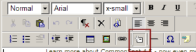
Once code is developed and registered, it is available for selection during Display Template creation. When designers select a field for inserting into a Display Template (shown below), a menu of available Render Masks for that field displays. Once selected, Field Render Mask code is invoked every time the Custom Element using that Display Template displays.


In many cases, the value of the field may represent a key to a record in a remote database, or the stored value is not exactly what should display to end users. For example, the stored value may be an employee ID value, but you want to display the employee's full name.
Related Links
You can download PDF versions of the Content Contributor's, Administrator's, and Elements Reference documents from the support section of paperthin.com (requires login).
Sites upgrading from versions earlier than release 6.0 should review the following (from the support section of paperthin.com - requires login):
For technical support:
 CommonSpot Field Types