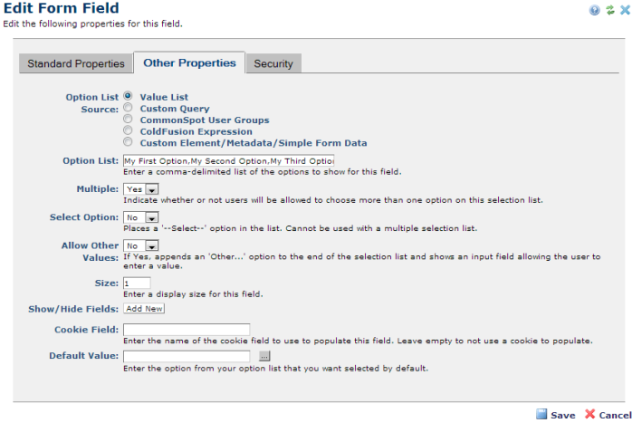
The Selection List renders a dropdown list or a list box, depending on the size specified. You can create the option list from content entered directly in this dialog, as shown below, or you can generate the list from a custom query, a ColdFusion expression, or from Element, Metadata, or Form data. You can also source the list from the Groups defined in CommonSpot. The source type you choose determines which other options are available for rendering the list.
See Edit Form Field for a description of Standard Properties and Security tab fields for this and other field types. Specifics for completing Other Properties for the Selection List field are described below.
Multiple: Enables/disables choosing more than one option in the list. When multiple selection is set to No, the option to show/hide list items is enabled, as described below.
Select Option: Places a --Select-- option in the list and makes the field required. Cannot be used with a multiple selection drop-down list.
Allow Other Values: Enables/disables appending a free-form text field for allowing custom values when other Selection List options don’t apply.
Size: Sets the number of visible options. Defaults to 1, to show the first option. Accepts any positive integer. If the value of the size attribute is greater than 1, but lower than the total number of options in the list, the browser adds a scroll bar to indicate that there are more options. If the Multiple option is enabled, defaults to 4. Required.
Show/Hide Fields: Displays only when Option Source is Value List and Multiple is set to No. Allows you to create rules to show/hide other fields within this form based on option selection. Use this to conditionally hide or show/make required other fields. Click Add New to create new rules for fields. Click Edit/Delete to modify or remove existing rules.

Cookie Field: This option is available for Custom Element form fields, simple forms, and metadata forms. It enables pre-populating fields from stored cookie values. Use this field to auto-complete forms containing fields that were completed in other forms. For example, once a user enters name, city, state, etc. in one form, fields requesting these values are prepopulated in the next form. You can use this feature for Text, Selection List, Multi-checkbox, Checkbox, Email, and Radio Button fields.
Default Value: The value that is populated and displayed within the Custom Element. The field displays either the default value only or is blank and cannot be updated or changed. Setting a default value is an option for all Custom Element field types except for Checkbox, Image, Tree Control, Formatted Text Block, and Date.
Related Links
You can download PDF versions of the Content Contributor's, Administrator's, and Elements Reference documents from the support section of paperthin.com (requires login).
For technical support:
 Option List Source