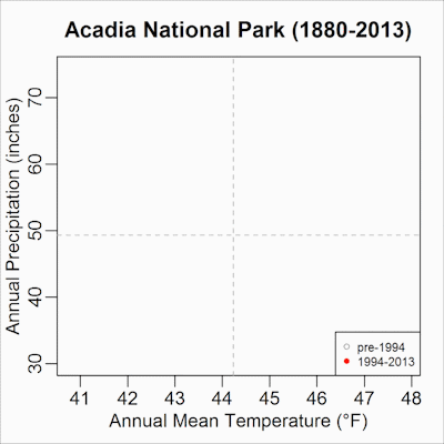
The animation to the right shows mean annual temperature and annual precipitation from a weather station in Acadia National Park. The station record goes back to 1880 and thus provides a long-term look at conditions. Recent climate (i.e., the past 20 years) is denoted by filled red circles, and the preceding 114 years are shown as open gray circles.
Climate change is a global phenomenon that manifests differently at local scales. Ongoing climate change is pushing average annual conditions to—and beyond—the extreme edge of historical conditions at many national parks. Recent average conditions at Acadia have been extremely warm and wet. Many parks have seen warming temperatures while precipitation has remained well within the range of historical conditions (e.g., Cape Hatteras National Seashore and Grand Canyon National Park). At some parks, average conditions have not changed dramatically (e.g., Mount Rainier National Park); however, other aspects of climate change such as storm frequency and intensity and sea level may be changing. These changing conditions influence both park management and visitor experience.
Data in these animations come from the Recent Climate Exposure research project.
Last updated: January 8, 2025