MENU
Cecil Doty
| Mission
66 Visitor Centers
Chapter 6 |

|
Characteristics of a Doty Design (continued)
Circulation and Organization
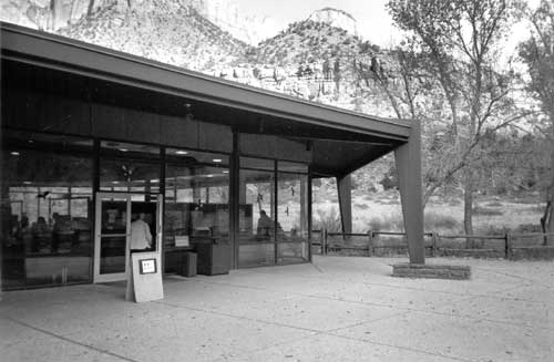
Doty considered the visitor center that he designed for Zion National Park, Utah, in 1957 one of his best, perhaps because it combined several of his most effective methods for organizing spaces and providing efficient circulation between them. Many of the features used so well at Zion were prominent in his later buildings: the central skylight, the two-story office wing, and the rear viewing terrace. The fact that, many years later, an expanded bookstore area would compromise the lobby space is also, unfortunately, characteristic of many of these buildings. The Zion facility is divided into a visitor center area and a two-story administrative wing that can be entered from the rear, an arrangement similar to that of the Headquarters at Rocky Mountain and Colorado National Monument's visitor center. This design strategy successfully segregates visitor traffic from administrative areas, while aesthetically highlighting the building's public service function. Visitors rarely notice the office wing, as their attention is directed from the parking lot to the exterior restrooms and lobby entrance. The administrative aspect of the building is not part of the visitor experience.
The Zion Visitor Center combines the idea of walking through the building to a viewing area with the central "hogan" skylight, both of which were also used a few years later at Wupatki National Monument near Flagstaff, Arizona. Whenever possible, Doty framed views to help determine visitor circulation and give additional functional meaning to a building. At Organ Pipe Cactus in Arizona, Doty encapsulates the view of the park with glass front and rear facades. Colorado National Monument encourages the visitor to walk through the building for a dramatic glimpse of the canyon. Even the stark Canyon de Chelly Visitor Center in Arizona, located away from the monument's featured canyon, includes a viewing terrace; the surrounding landscape did not have to be the most dramatic of the area to require an outdoor porch. This arrangement was also used for the Madison Junction Visitor Center at Yellowstone, where visitors entered the porch and then passed from the lobby to a wood deck called the "view lobby." To the left of the entrance space was an exhibit area and to the right, an auditorium. The visitor center at Mount Rushmore (now demolished) was one of the few examples featuring a path bypassing the lobby. Visitors could proceed directly to the view terrace and enter the building from the exhibit room.
Figure 70. Zion Visitor Center in 1998.
(Courtesy National Park Service.)Although Doty often creates pathways through his buildings, he also assumes that the visitor's first stop is the lobby—the location of the information desk, maps, and other orientation material. Additional services, such as the auditorium and exhibits, are more or less subservient to this central space. Sometimes, Doty treats these areas as entirely separate rooms, but, more frequently, he uses a free-flowing plan to blur the boundaries between the various service areas. The exhibit space at Montezuma Castle in Arizona blends into the lobby; at Canyon de Chelly, only a half-room partition separates the video presentation area from the museum. Upon entering the lobby of Colorado National Monument, one naturally turns right to examine the exhibits. The Hoh Visitor Center in Olympic National Park treats lobby and exhibits as a single entity. Because of its larger size, Zion houses its museum and auditorium in completely enclosed rooms separated from the information desk. A similar arrangement is used at the Death Valley Visitor Center, where the auditorium and exhibit space flank either end of the lobby. This building is loosely arranged around a courtyard, the visitor half of which is owned by the state of California. Although located just across the courtyard, the administrative wing is Park Service property.
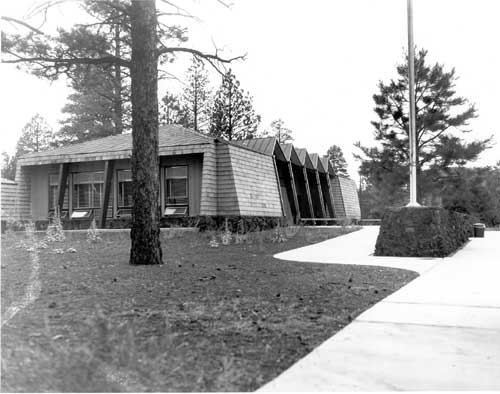
As if to prove that his plans depended on many factors, Doty designed two visitor centers with unusual programs in the final years of Mission 66. The visitor center at Sunset Crater, Arizona, located some distance from the crater itself, is the simplest possible in terms of circulation and use. It is essentially one big room with offices on one end and restrooms on the other. No effort is made to obtain a view or direct the visitor outside. Just a month later, Doty designed a complex of three "huts" for Center Point in Curecanti, Colorado. Although this visitor center appears to function as three distinct buildings, interior areas are linked. One corner of the lobby leads into the exhibit space, the second of the three square huts. Restrooms are attached to this area but entered from the outside. The final hut is an office wing entered from behind the information desk in the lobby. This portion of the visitor center is partitioned into several offices and work spaces.
Figure 71. Visitor Center, Sunset Crater Volcano National Monument, near Flagstaff, Arizona.
(Courtesy National Park Service Technical Information Center, Denver Service Center.)As much as one would like to isolate various types of Doty visitor center plans based on location and regional requirements, there is no standard pattern. Emphasizing the relationship between inside and outside—bringing the outdoors in—was a characteristic of Doty design, but it was also common to modern architecture in general. Like the flow diagrams drawn up during design conferences, Doty's plans shuffle components according to many factors, not the least of which was budgetary. The architect himself was quick to acknowledge that design ideas often entered his head for no reason at all. Behind all of Doty's work, of course, was not only an architectural background, but a lifetime influenced by extreme social and technological change.
In a presentation at the WODC conference on visitor center planning of February 1958, Doty articulated his ideas about visitor center design using "space relationship diagrams" of Badlands National Park and Theodore Roosevelt National Park, two sites of current interest. As Doty explained, traffic flow diagrams were most useful in the early stages of planning, when the architect was engaged in the initial three steps: considering traffic through the entire park, analyzing flow in the visitor center zone, and planning for the parking area and visitor center itself. Circulation through the building should be clear without posted signs. "If the circulation is simple and obvious, and space is adequate, then clockwise, or counter-clockwise flow, locations of information counters, etc., become somewhat incidental." [23] Doty's diagram's illustrated his belief in free-flowing movement through buildings with arrows indicating entrances and shaded areas showing circulation in any direction. The "lobby," "exhibits," and "audio" were analyzed according to the percentage of space devoted to various activities, including viewing, standing, displaying information, and circulation. Although Doty's conference presentation suggests a calculated approach to design, this methodology was probably not intended as an architectural model, but merely as a guideline for more flexible planning.

|
History | Links to the Past | National Park Service | Search | Contact |
http://www.cr.nps.gov/history/online_books/allaback/vc6c.htm
![]()