Dynamic ecosystems create dynamic datasets that can change dramatically or minutely with each round of monitoring. Sometimes the only way to detect changes over time (sometimes decades) is for park managers, scientists and researchers to be able to "see" the data with the aid of visualization tools. Data visualizers complement the scientific reports that result from our long-term monitoring program, and often combine multiple types of visual data such as maps, charts, and graphs to help people identify and understand the complex relationships between landscapes, climate, and natural resources.
Explore different types of data visualization using the links below:
Climate Visualizer
Make your own climate graphs and tables! Visualize data from air and precipitation monitoring stations in the Northern Great Plains Network.
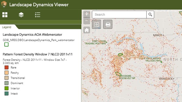
Landscape Dynamics Viewer
Explore landscape dynamics data layers with this user-friendly, interactive map from the National Park Service

Bird Data Visualizers
Explore bird population trend estimates, generate maps of survey locations, and run data queries!
Last updated: May 19, 2020