
|
|
|
2007 ESRI UC Displays |
 |
||
|
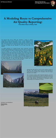
A Modeling Route to Comprehensive Air Quality ReportingFrom Raw Data to Policy Tool
The Air Quality Condition (AQC) Scorecard represents a new tool for evaluating and reporting the air quality in our National Parks; and by providing a means for integrating several parameters into a single score it helps facilitate the distribution of information and the understanding of consequences of policy. Input Data: Interpolations of 5-year averages created for the Air Atlas proect were used as input. These interpolations were created using the inverse distance weighted method of interpolation. In addition to interpolations, input layers were created for supplemental risk factors. Parks with ecosystems especially sensitive to nitrogen or sulfur deposition, as well as parks located with EPA designated non-attainment counties for ozone or particulate matter were given an additional weighting after the reclassification. Status: Interpolations derived from air quality monitors were used to determine air quality status. Trend: The difference in interpolated values of two five-year averages were compared to determine values for the air quality trend. Confidence: The straight line distance from air quality monitors used to create the interpolations was used to determine the confidence of the air quality estimate. Models: Using the model builder applicatoin within ArcMap allowed for the transformation from quantitative data in the form of interpolations to qualitative data in the form of a ranked grid. By gathering specialists together and using their expertise to create cut points, the floating point values of the interpolations were reclassified into ordinal data. Once the interpolations had been reclassified it was then possible to combine the difference parameters in a meaningful way to create a composite score for each NPS unit. An additional benefit to automating the scoring process through using model builder is that by substituting updated interpolations, future updates of AQC scores can easily be computed. Final Product: The three parameters of status, trend and confidence were then assembled into a single symbol for each NPS Unit within the vital signs program. The Air Quality Condition score determined for each unit provides a new and innovative way for evaluating progress towards meeting air quality goals as well as reporting conditions and trends were data is limited. The final status and trends are assembled into a table as well as a map for distribution. While the final classification may be of a much more qualitative nature than the original input data due to the ranking process, the final symbols convey the information in a more undertsandable way which can be invaluable to policy and decision makers less familiar with air quality data. Content by Drew Bingham NPS ARD. Links of interest:
For NPS go to inside for more information about the conference |
|||
| ParkNet | US Department of the Interior | FOIA | Privacy Policy | Disclaimer | FirstGov |