Last updated: January 18, 2024
Article
Color Pallets Saving Buildings from Demolition
Article from the proceedings from Are We There Yet? Preserving Roadside Architecture and Attractions, April 10-12, 2018, Tulsa, Oklahoma. Watch a non-audio described version of the presentation on YouTube.
Color Pallets to the Rescue: Saving Buildings from Demolition
By Tania Alam, Architectural Conservator
Abstract
Paint color palettes are an inexpensive preservation tool that have been used to great effect. They may not be accurate, but they work.
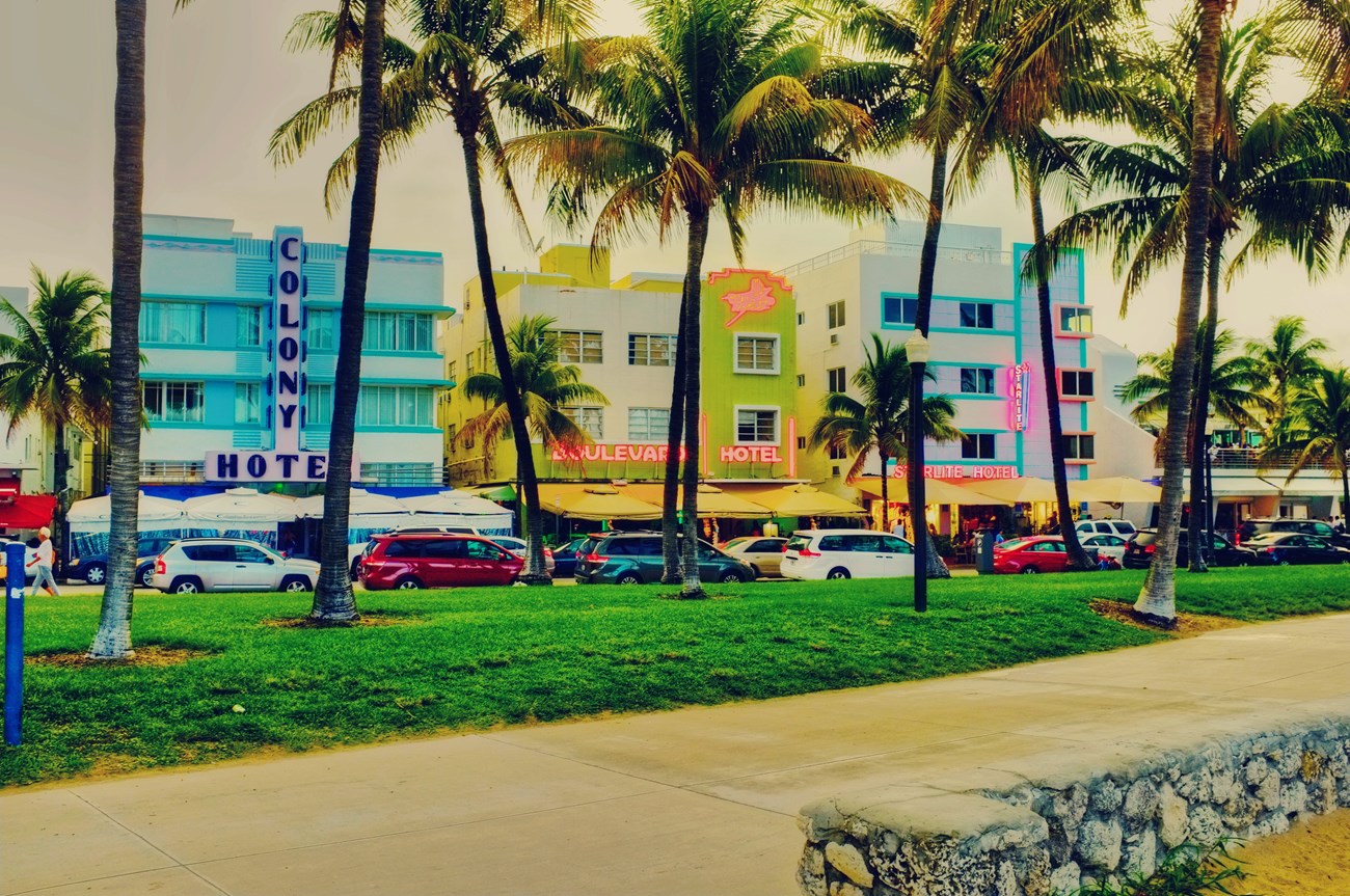
Today, one cannot imagine the Art Deco Historic District in Miami without the colorful buildings that line its oceanfront. Pastel shades of blue, pink, vibrant yellows, and greens give a characteristic rhythm to the area. However, it was not such a bright place in the 1970s. Older people were returning to inexpensive Miami Beach, crime was on the rise, and businesses were in decline. The older buildings fell into disrepair. Local developers planned to tear down most of the existing buildings to make way for more “profitable” construction; all part of a multi-million-dollar urban renewal project that was believed would increase revenue and “save” the district from its changing demographics. Barbara Capitman, founder of Miami Design Preservation League (MDPL), put up a fight and was able to get the area listed on the National Register of Historic Places in May 1979. It was the nation’s first 20th-century neighborhood to be recognized as “historic.” Another member of MDPL, Leonard Horowitz, made a significant difference by creating a color palette. Horowitz wanted to attract the viewers’ attentions to the intricate Art Deco features on building facades and simultaneously create a sense of continuity through changing shades of color from one building to the next. His Pastel Palette proved successful – most of the hotel buildings still stand today, while newer structures continue to preserve the look for which South Beach is famous.
An earlier Main Street rejuvenation project in downtown Columbus, Indiana employed the application of a similar concept. In 1961, designer Alexander Girard was asked to beautify the storefronts along Washington Street in the historic business district. He visualized the restoration primarily through the use of a color scheme, which would highlight the architectural features of the Victorian commercial buildings to work in tandem with the newly designed signage. Through this new “balanced” aesthetic, Girard was able to convince the locals to continue using and consequently preserving the older buildings. His approach has later been emulated for other Main Street restoration projects.
Although not necessarily based on scientific or historic facts, these “historic” color palettes have played significant roles in the preservation of roadside architecture in American cities. They were creative, inexpensive, and easy to apply. And they have greatly facilitated the preservation of buildings that were otherwise destined for demolition.
Color Palettes & Historic Preservation in America
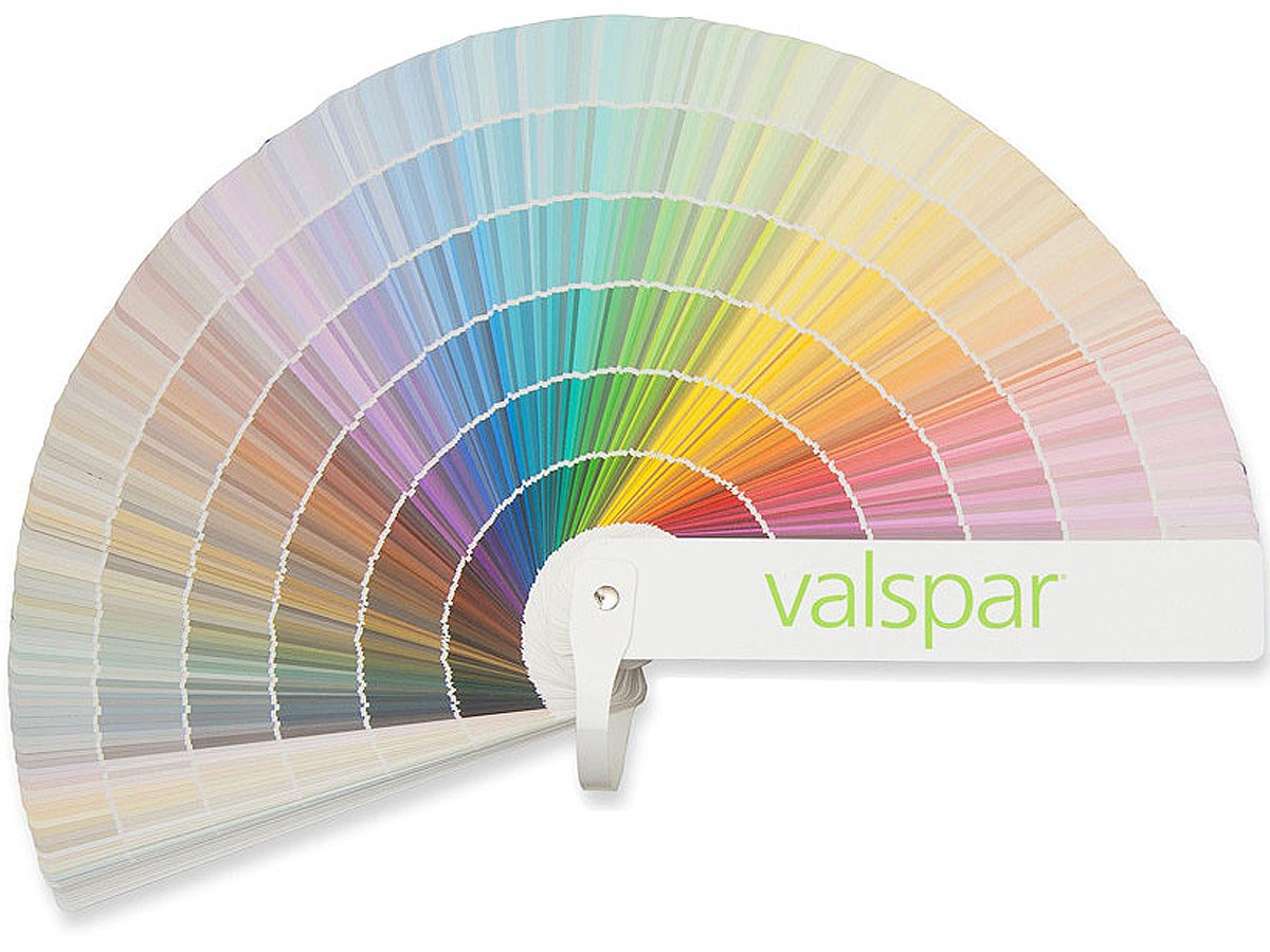
The term “palette” is frequently used to refer to a selection or range of colors, which are often meant to establish unique visual styles. The concept of the architectural color palette in America can be traced back to as early as 1842 when Andrew Jackson Downing, a landscape designer, put forward six shades of colors (Fig. 2) that he believed were highly suitable for the exterior of cottages and villas of that period. He provided lots of description on how to use these colors, and also wrote extensively on interior decoration.[1] With the passing of time, more color palettes were developed and made popular among the American consumers especially after the industrial revolution by major paint manufacturing companies through advertisements of their latest paint products. The idea remains extant today as demonstrated by the numerous color collections displayed in paint stores (Fig. 3). Prominent among these collections is the “Historic Color Palette” that claims to represent paint colors of different architectural styles from various regions and periods of the American history.[2] Many of these “historic color palettes” appear to have been derived in the process of restoring historic sites and structures, which were later produced commercially, and made available to the public.

Avery Classics, Columbia University
Valspar website
Research shows that color palettes have played an important role in the field of historic preservation in the United States—historic Colonial Williamsburg being one of the major examples. To recreate the original appearance of the Colonial structures in the area, great emphasis was put on restoring the original paint colors for both the exterior and interior. Scientific architectural paint research and thorough study of historic documents were the primary methods used in the determination of period-specific colors in this project. The Colonial Williamsburg color palette has been produced commercially since 1937 and appears to be constantly developing. There are other “historic color palettes,” which are not advertised or produced commercially, but have played significant roles in preserving buildings and historic districts in America – two such case studies are described in this paper.
Saving Roadside Architecture
In contrast to color palettes developed through architectural paint research, there are “historic color palettes” that have originated from people’s imaginations, and yet have had great impacts on the aesthetic quality of respective areas. The color palettes of Columbus Storefront Restoration Project in Indiana and South Beach in Miami are two examples where color palettes gave definition to and facilitated the preservation of roadside architecture in American cities.
Columbus Storefront Project, IndianaIn March 1961, architect and designer Alexander Girard was offered the possibility of cleaning up and beautifying the fronts of the stores and other business houses up and down Washington Street (in Columbus, Indiana) by S.E. Lauther, the president of the Irwin Union Trust Company. The project was part of a joint effort by the Downtown Development Agency (DDA) and the commercial redevelopment committee of Chamber and Central Business Association (CBA) to give the commercial zone of downtown Columbus what was then commonly called a “facelift.” Its purpose was to save the business district from turning into a ‘jungle’ of conflicting colors and neon signage of various shapes and sizes – what architect and critic Peter Blake referred to as “the mess that is man-made America.”[3]
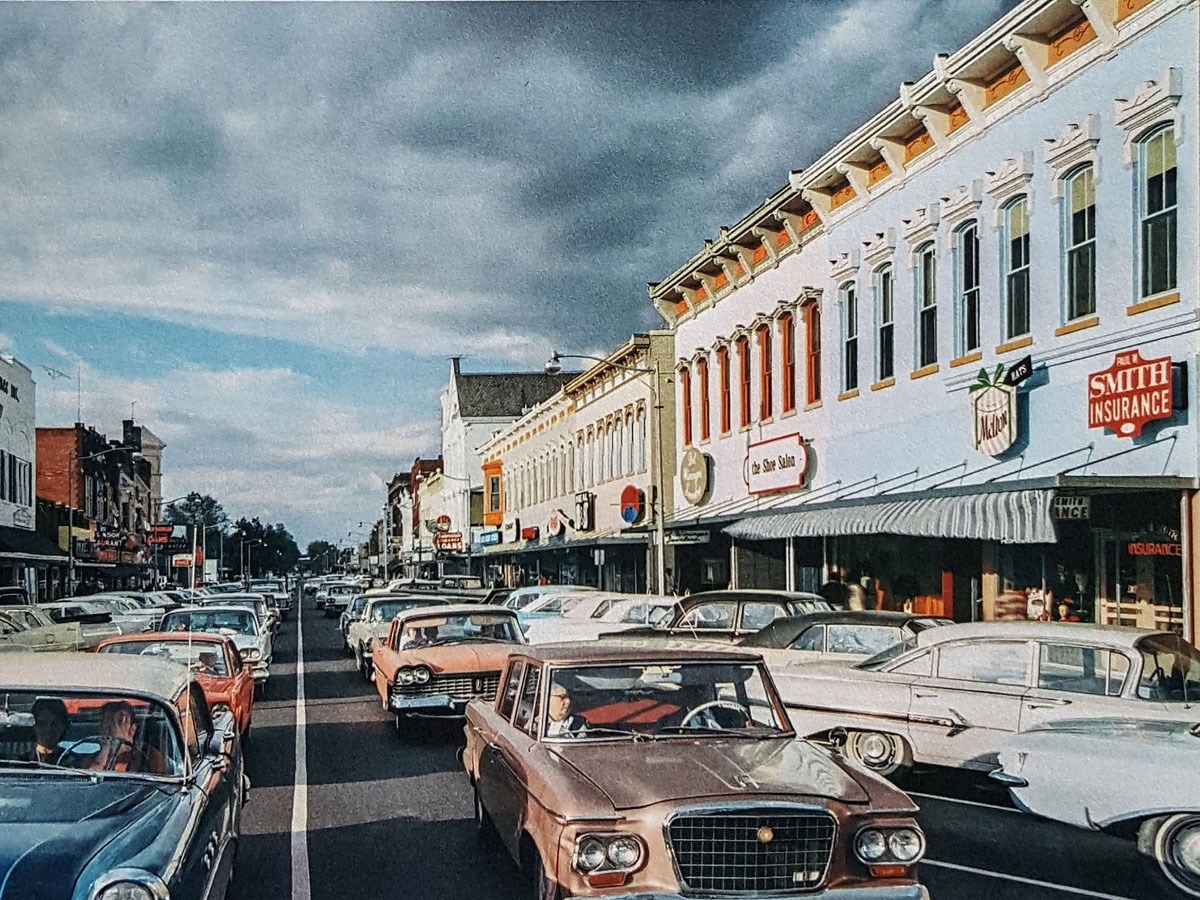
Hailing from Santa Fe, New Mexico, Alexander Girard was an architect by profession, and was well-known for his keen sense of order. He was better known as a designer or artist for his works with color in furniture and textile design. Not surprisingly, color was one of his most important tools in the storefront restoration project. He created a palette of twenty-six colors that he thought was historically appropriate for the Victorian storefronts and commercial buildings along Washington Street. Girard and his associates decided on the colors by examining and studying the architectural details on the Victorian structures – the exact methodology was not explained. The color scheme was intended to accentuate the period architectural details on the buildings, and work simultaneously with the addition of new porcelain enamel signs and fluorescent lights installed above the marquee level on all stores to create a unified streetscape. Certain shades predominated the scheme in their application on store elevations – orange, green, white and buff along with a sky-blue. The bright colors were used primarily to emphasize decorative elements such as the cornices, windows, and their lintels and trim, while more restful shades (i.e. sky-blue and beige) were applied on the main body of the buildings, creating what Girard felt was a balanced aesthetic for the block fronts (Figs. 4 & 5). [4]

Alexander Girard: A Designer’s Universe, 279
Alexander Girard: A Designer’s Universe, 279
The project came to be known as “the model block project” and “pattern painting of downtown Columbus,” as it was carried from one block to the next in phases.[5] After the first model block between Fifth and Sixth Streets on the east side of Washington Street was completed in 1965, store owners from adjacent blocks began to ask for design schemes for the buildings in their blocks. The whole process was never legislated or strictly enforced but was executed through voluntary acceptance from owners.[6] This approach allowed the community to become involved in the restoration project, which led to an appreciation for the historic buildings in the area. The Columbus Storefront Project drew national attention for its success and became a model for later street transformation projects.[7]
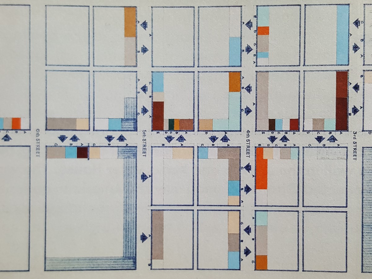
Today the mock-up scale models (Fig. 6), which Girard first used to convey his idea of a harmonious streetscape to the public, are considered artwork themselves. These models are used in tandem with color-coded maps (Fig. 7) by building owners who want to recreate the look from Girard’s design from 1965.[8]
The palette, which draws inspiration from colors used on Victorian houses, is not based on scientific paint analysis; neither is it known to have relied on historical documents specific to the storefronts. Therefore, while it is promoted as historic, it is not. The colors are a mid-twentieth century view of early-twentieth century color schemes. The Main street revitalization program added to the burgeoning architectural movement in Columbus, Indiana in the late 1960s. Girard’s color scheme along with modern buildings by well-known architects, all helped to attract more visitors to the city, promoting Columbus as an “archi-tourism” center for people to appreciate Modernism.[9]
“It’s a different kind of “historic” in that it’s from the 1960s. This palette, though, is the most important one for Columbus, Indiana.”– Richard McCoy, Director, Landmark Columbus, 2017.[10]

Alexander Girard: A Designer’s Universe, 280
Alexander Girard: A Designer’s Universe, 280
Pastel Palette, South Beach, Miami
The Miami Beach Architectural Historic District of South Beach is known internationally for having one of the largest collections of Art Deco buildings in the world. Its signature is a range of colors used on buildings lining the oceanfront that include pastel shades of yellow, pink, sky-blue, purple, green, and many more.
Popularly known as the “Art Deco District,” the area was listed on the National Register of Historic Places in May, 1979 following a large campaign by the Miami Design Preservation League (MDPL) against a multi-million-dollar urban renewal project below Sixth Street that threatened to displace the elderly population in the area, making it the nation’s first urban twentieth-century Historic District [11] [12]. However, being listed on the National Register proved inadequate to prevent landmark buildings from being destroyed. Significant structures like the Boulevard Hotel at 775 Dade Boulevard was demolished in April 1980 and the New Yorker by local architect Henry Hohauser was torn down in 1981 in order to make way for what was thought to be more profitable construction. Developers thought new and “modern” construction would increase revenue and “save” the district from its changing demographics. During the 1970s, there had been a shift in the population of South Beach; as older and retired people moved in, crime increased, businesses declined, and the older buildings fell into disrepair. The National Register listing did little to persuade people to spend money on restoring these buildings and to save the neighborhood of South Beach. This is where the color palette (Fig. 8) created by an interior designer, Leonard Horowitz, was able to make a difference.
“I’ll take care of the buildings. I’ll do the frosting on the cake because these look like they’re going to be a lot of fun to play with.”– Leonard Horowitz, in a film called “Pastel Paradise,” 1988.[13]
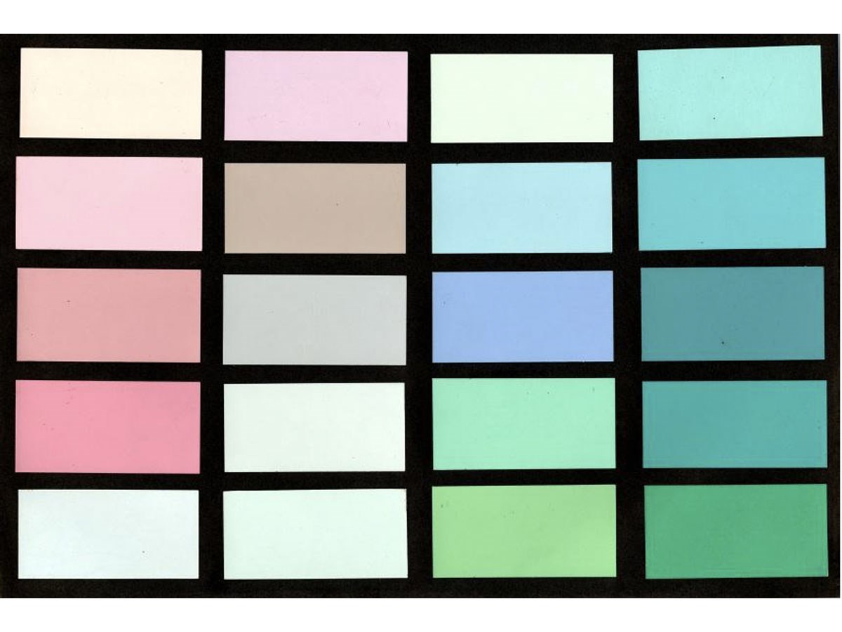
http://wlrn.org/post/meet-man-behind-all-those-south-beach-pastels
With his love for Art Deco designs, Horowitz shared Barbara Baer Capitman’s (founder of MDPL) dream to rejuvenate South Beach, and reinstate its old glory from the 1930s. The significance of the area, however, lay not only in its large concentration of Art Deco buildings but also on the wide variation and fine composition of Mediterranean and Moorish architectural influences, creating a unique vernacular style of Deco buildings.[14] Horowitz envisioned the Deco revival through the use of color that he believed would add excitement to the dull gray dilapidated buildings along the beach.[15]] His idea was to accent the building decoration attracting attention to the details on the Art Deco structures.
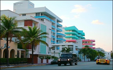
Historically, the hotels, apartment buildings and stores were mostly painted white with little touches of jade green, ochre, or coral.[16] But the color scheme that Horowitz visualized was radically different. His goal was not merely to save the stylish Art Deco Buildings, but to call attention to them and to create a unified streetscape. The body color of one building would transfer to the trim of the next while the colors would change shades to maintain continuity. Horowitz’s color palette for Miami Beach was created using colors derived from his surroundings; the sun, the sky, the sand and the ocean.[16] [17] As a result of this romanticism South Beach today is filled with buildings that are painted in colors such as peach, cream, mauve, aqua, shell pink, golden sand, seafoam green, Caribbean blue and sunrise orange. The buildings along Ocean Drive bring to life the idea of a continuous streetscape that Horowitz dreamed of (Fig. 9).
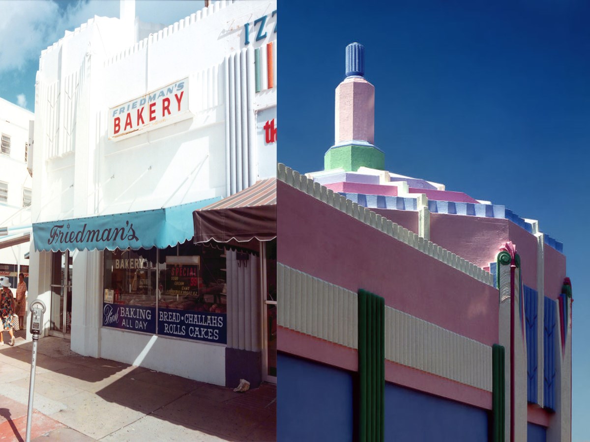
The first building to be painted using the colors developed by Horowitz was the Jewish Friedman’s Bakery on the corner of 7th and Washington Avenue – now Manolo, a restaurant (Fig. 10). It was painted with shades of cotton candy pink, periwinkle blue, buttercream and mint green, giving it the appearance of a fancy birthday cake. Although such color combinations were not unfamiliar on the streets of Miami, public reactions initially were not favorable. Within a year, as more buildings were painted, people started accepting Horwitz’s pastel color scheme. It became known as the “paint and awning” project – which had the trim and awnings of storefronts match the new color scheme along the commercial strip from Fifth Street to Lincoln Road.[19] In 1982, the Bakery was featured on the cover of Progressive Architecture magazine, photographed by the famous Steven Brooke, who was of the opinion that Horowitz had drawn inspiration from Chicago’s second World Fair of 1933-34.[20] The magazine feature along with television shows like Miami Vice, (that showcased the Art Deco setting as a backdrop and where the colors of the food carts that appeared in the opening credits were chosen by Leonard Horowitz) helped the district reach a greater audience, and gain the much needed national attention to save its buildings from further demolition.
The Pastel Palette was not the only factor that contributed to the eventual preservation of the Art Deco District, but it certainly played an important role in attracting and generating public opinion regarding the significance of buildings in the Historic District and the need for their preservation. More people began to voluntarily paint their buildings in South Beach with colors from Horowitz’s palette. Today, the Historic & Environment Preservation Board (HEPB) in the City of Miami regulates the use of light pastels similar to those developed by Horowitz.[21] Moreover, the City of Miami has a list of approved colors, which can be obtained from the Building Department, and at present uses color numbers assigned by the Sherwin-Williams Company.[22] No information, however, was found regarding any company that may have worked with Horowitz at the beginning, or about any commercial production of the Pastel Palette in later years. Nevertheless, the palette is very popular in Miami, and has been translated into other building finishes such as the “Cement Tiles” by the Villa Lagoon Tile Company, which offers over seventy “South Beach” colors.[23]
Results & Analysis
Washington Street in downtown Columbus was revitalized in the late 1960s by Alexander Girard through a color palette he created. Girard’s twenty-six colors were chosen with the intention to “organize” the buildings along the street. Although the colors were thought to be historically “appropriate,” no form of architectural paint research was performed (e.g. in the Colonial Williamsburg Restoration Project that began in 1928). Girard was known to have carefully studied the old Victorian buildings and the period-specific architectural details on them, but specific methods were not elaborated. Girard may have looked at color cards and paint brochures to determine popular colors from the period when the buildings were built before deciding on the overall palette for the project. However, close inspection suggests that some of the colors used were predominantly those popular in the 1960s.
Although not derived from scientific research of existing paint samples, the resulting palette used to restore the run-down Victorian buildings provided the storefronts with a fresh and de-cluttered look, and a colorful aesthetic that resonated with the public. This ultimately caused the community to look at old buildings in the area with a different perspective; people became more eager to restore old buildings instead of tearing them down for “modern” reconstructions. Therefore, Girard’s palette – although not authentic – served as a tool that visually organized the buildings along Washington Street, which promoted and enabled the preservation of historic buildings in downtown Columbus, Indiana.
The Pastel Palette of South Beach had a significant effect on tourism in the area. It was created in the late 1970s by a man driven by his love for and desire to save Art Deco buildings in Miami. This large group of buildings, which has defined the historic district’s fabric, possessed unique vernacular characteristics. Perhaps, Leonard Horowitz – who was known to make paintings influenced by architectural styles of the 1930s-1940s – thought putting on a fresh coat of paint on the not-so-old but disheveled structures was the simplest, cheapest, and quickest means to catch people’s attention. An interesting color scheme would generate appreciation and ultimately save these Deco buildings from eventual demolition. Horowitz largely used his imagination to select the colors he thought would work best. It is likely that he may have also drawn inspiration from Art Deco buildings like the Radio City Music Hall, which has colorful medallions depicting different performing arts on its façade (Fig. 11). He was known to have lived in New York City prior to moving to Miami. In any case, the soft pastels that Horowitz used to paint the buildings created a stir in the public, and attracted attention from all around the country, and the buildings were saved – contributing to the present day aesthetics of South Beach, Miami.
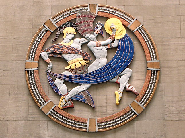
Andrew Prokos Photography
The new color scheme brought attention to the buildings and the district rapidly gained popularity among tourists as a preferred vacation destination. As the economy of South Beach quickly improved, it displaced the majority of the elderly population for whom the whole preservation initiation was originally taken up. The Pastel Palette was initially conceived as a tool that would allow the saving of buildings, which was by itself the tool to prevent the displacement of elderly population by the South Shore commercial redevelopment project of the late 1970s. [24] Despite the unintended consequences, Leonard Horowitz’s palette of soft and flamboyant colors forced people to take notice of and appreciate the beautiful Art Deco buildings in Miami and saved them from being lost. It played an extremely important role in the preservation and revitalization of the built fabric of South Beach Historic District. As an acknowledgement of this accomplishment, it is now mandatory within the historic district to use light pastel colors, in order to maintain an aesthetic that in reality first appeared in the 1980s and is now considered “historic.”[25]
Conclusion
Examining the two “historic color palettes” presented in this paper – Pastel Palette by Leonard Horowitz and the palette created for the Storefront Restoration Project by Alexander Girard – one has to wonder if authenticity of colors should be a matter of great concern. For South Beach, the pastel colors played a vital role in enhancing the look of buildings along the oceanfront, created a pleasant aesthetic, which shaped the regional characteristic of South Beach architecture, and saved the historic buildings. It attracted tourists from all over the world and bolstered the economy of the area (and continues to do so). The storefronts on Washington Street in downtown Columbus looked neglected. Girard’s palette helped revive interest in the classic “Main Street” by providing visual harmony along the street, without having to demolish and reconstruct all the buildings. His approach was referred as a model for later Main Street projects. A concern for historians with the designed “historic color palette” is that buildings were never aesthetically uniform like the designed color palette for Washington Street in downtown Columbus or in the historic district of South Beach, Miami.
Nevertheless, both color palettes – while being more creative than fully historically accurate – became an inexpensive, simple, and easy way of interesting people in history. In their attempts to restore and save the historic fabric, both these color palettes essentially created new aesthetics in the respective areas. The Pastel Palette saved many hotels from being demolished along the oceanfront in South Beach, many of which still stand today, e.g. the Breakwater, the Beacon Hotel, the Colony Hotel, the Carlyle, Essex House Hotel, Leslie Hotel, the Marlin Hotel, the Park Central Hotel, the Raleigh, and the Webster. On the other hand, Girard’s palette for the Victorian structures may not be used in the present time, but it proved successful in preventing the demolition of the buildings. Today, Washington Street can still be seen lined predominantly with two to three storied commercial buildings retaining their historic architectural characteristics.
By creating aesthetics that were attractive to people, both palettes were able to highlight the value of historic buildings to the local communities and created a link to the past. They became a tool for historic preservation that was accessible to all. These color palettes came to the rescue of buildings that would have otherwise been demolished, and consequently preserved the roadside architecture in Miami, Florida, and Columbus, Indiana.
Endnotes
-
Downing, A. J., Cottage Residences: A Series of Designs for Rural Cottages and Cottage-Villas and their Gardens and Ground adopted to North America. (New York and London: Wiley and Putnam, 1842), 22-23. A, B, and C are shades of gray, and E. F, G of drab or fawn colour; which will be found pleasing and harmonious in any situation in the country. Stuccoed or cemented buildings should be marked off in courses.
-
For the purpose of this paper, a “Historic Color Palette” has been defined as the following: “A group of paint colors, which were selected by an individual or a committee, to represent colors, believed to be used in architecture during different historic periods in America, and can sometimes be specific to distinct places from across the country.”
-
Peter Blake, “God’s Own Junkyard,” (New York: Holt, Rinehart and Winston, 1964), 7.
-
Lange, Alexandra, “Alexander Girard in Columbus,” in Alexander Girard: A Designer’s Universe, (Germany: Vitra Design Museum, 2016), 278-278.
-
This information was gathered from early articles on the project in newspapers in the collection of the Columbus Indiana Architectural Archives.
-
“CBA Plans More Store Painting,” Target, March 1, 1966.
-
Lange, 281-282. A 1975 Washington Post editorial pointed to Girard’s Co-lumbus storefronts as a model for the transformation of G Street, while designer Ruth Adle Schnee also referred to it when she consulted on the repainting of Monroe Street in Detroit’s Greektown in the late 1960s.
-
Lange, 278. Girard took scale photographs of all of the storefronts in the central business district, and then he and his staff painted each building a combination of the 26 colors he had selected for the project, mounted these paintings on Masonite boards and shipped them to Columbus, where they were exhibited on Washington Street. These panels were set up on wood stands to simulate the continuous street front along individual blocks.
-
Susan Stamberg, “Columbus Ind.: A Midwestern Mecca of Architecture,” WNYC Radio, July 31, 2012, accessed on April 27, 2017 http://www.npr.org/2012/08/04/157675872/columbus-ind-a-midwestern-mecca-of-architecture. The Modernist buildings – mostly geometric and made of glass and steel – are not immediately visible, interspersed as they are with old, 19th-century, gingerbread-like structures; but more than 60 public buildings in Columbus have been built by a veritable who’s who of modern masters – I. M. Pei, Eero and Eliel Saarinen, Cesar Pelli, Richard Meier, Harry Weese, Robert Venturi and James Polshek, to name a few… Then, in the 1960s, thanks to some design-conscious decisions by the biggest business in town, the architectural revolution soared with schools, fire stations, an all-glass bank, a courthouse, city hall, a world-class golf course and a jail – a relatively attractive jail.
-
Richard McCoy’s statement regarding Alexander Girard’s 1960’s palette for the Storefront Restoration Project, Indiana. Contacted via e-mail, February 24, 2017.
-
Miami Design Preservation League, “A Brief History of MDPL,” http:www.mdpl.org/about-us/about-miami-de-sign-preservation-league/a-brief-history/. The Miami Design Preservation League (MDPL) was formed through the efforts of Barba Baer Capitman and her son John Capitman. The initial impetus was to find a project to honor the United States’ bicentennial; the Capitmans worked with designers Leonard Horowitz and Lilian Barber to identify a concentration of 1930s buildings in South Miami Beach that the group felt could be a historic district of 20th century architecture.
-
Stofik, Mary Barron, Saving South Beach, (Florida: University Press of Florida, 2005), 26. The Miami Design Preservation League was made up of people whose focus was primarily on the design and time period of buildings and was concerned with the people who lived there. At its inception, the purpose of the organization was to preserve the neighborhood of South Beach by creating a historic district called “Old Miami Beach.”
-
Julia Duba, “Meet the Man behind all those South Beach Pastels,” WLRN Public Radio and Television, July 26, 2013, accessed February 14, 2018, http://wlrn.org/post/meet-man-behind-all-those-south-beach-pastels
-
Stofik, 31.
-
Gaines, Steven, “Leonard and Barbara,” in Fool’s Paradise: Players, Poseurs, and the Culture of Excess in South Beach, (New York: Crown Publishers, January 2009), 132-133. Leonard realized that one of the aesthetic problems with the Art Deco district was that it was colorless and drab; the buildings were painted white or gray or tan and the lines and details disappeared into the general dullness of the buildings. South Beach needed color, but not just any colors; it needed a color scheme that would suit it.
-
Stofik, 78.
-
Gaines, 133. The folklore is that Leonard invented the colors sitting in a lawn chair on Ocean Drive, staring at the heliotropic sea and sky, smoking joints and watching the soft colors play-ing in the changing light: peppermint, magenta, seashell rose, peach, pale lilac, mint, powder blue, powder pink, and a touch of tangerine.
-
Julia Duba.
-
Stofik, 102-103. Lynn Bernstein, the assistant director of the Miami Beach Development Corporation, scored her first success (in persuading owners of retail stores to freshen up their buildings with a new coat of paint) with the owner of sixteen store-fronts in the 600 block of Washington. The first building to be painted was a Jewish Bakery. Bernstein’s next task was to convince merchants to pay $25 to paint their awnings to match the new color scheme.
-
Luke Crisell, “The Most Beautiful Art Deco Buildings in Miami, Chosen by the Man Who Spent 30 Years Photo-graphing Them,” December 2, 2015, accessed April 5, 2017. http://www.wearesweet.co/culture/art-design/g328/most-beautiful-art-deco-miami/
-
City of Miami, “Historic Preservation General Design Guidelines,” (City of Miami: September 2011), 33.
-
Information collected from Jack Johnson, Vice-chair Officer at Miami Design Preservation League. Contacted via e-mail, April 26, 2017.
-
Villa Lagoon Tile, “The South Beach Palette – Cement Tile Colors,” accessed April 9, 2017. https://www.villalagoon-tile.com/south-beach-collection-colors.html
-
“Barbara Baer Capitman,” South Beach Art Deco Reborn, accessed April 8, 2017. http://25327546.weebly.com/barba-ra-baer-capitman.html. The Miami Beach commission planned to revive the city, creating a redevelopment agency in 1973 and a plan name “South Shore” in 1975. This plan involved tearing down old hotels and replacing them. “We were talking about the neighborhood and how they all helped one another,” John (Capitman) said. “We were trying to think of a way to keep the community from being destroyed, and then we began looking at the buildings… the unique design they have… and we thought, Maybe these lovely buildings can be used to save the people who live in them. That was how the movement was born.”
-
City of Miami, “Historic Preservation General Guidelines,” (City of Miami: September 2011), 33.‘… The first three intensities of a neutral or light pastel col-or shade are recommended. No one color may be applied to the entire structure; a minimum one main body and one trim color. Dark colors and bright hues are not allowed on structures. Trim color may be a darker or lighter (shade) than the body of the building.”
Symposium
You can read other articles from the proceedings of Are We There Yet? Preserving Roadside Architecture and Attractions, April 10-12, 2018, Tulsa, Oklahoma. Or explore other content from the National Center for Preservation Technology and Training (NCPTT).
