Last updated: February 26, 2025
Article
50 Nifty Finds #8: Design for the Times
Many people today are familiar with the Arrowhead as the official symbol of the National Park Service (NPS). It is featured on NPS web sites, road signs, buildings, publications, uniforms, vehicles, and more. For a brief period in the 1960s, however, the arrowhead was replaced with a new NPS symbol that incorporated the Parkscape U.S.A. design. Parkscape’s bold symbol represented natural, historical, and recreational parks and the interconnectivity needed to protect people and the environment. Popular with professional designers, it wasn’t embraced by most NPS employees and was soon abandoned.
The Man with a Plan
The NPS celebrated its 50th anniversary in 1966. Park roads and facilities were in the best shape they had ever been thanks to Mission 66, a 10-year design and construction program begun in 1956 to modernize park infrastructure and visitor services. However, the post-World War II economic boom, growing middle class, improved park facilities, and surge in outdoor recreation continued to increase pressure on national parks. Visitation had more than doubled since 1956, to 133.1 million or two out of every three Americans. As NPS Director George B. Hartzog, Jr. put it, “Today we face the problem of urbanization and a growing population with more and more leisure time.”
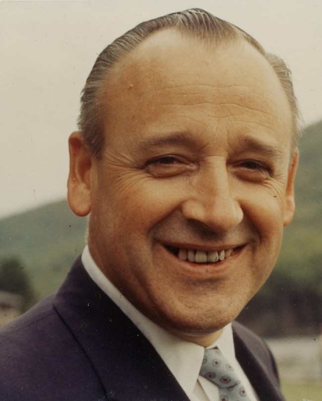
Hartzog’s solution to meet this challenge was a long-range program of ideas, ideals, and objectives called Parkscape U.S.A. “Parkscape” was coined to reflect the Service’s areas of concern—landscapes, seascapes, riverscapes, and cityscapes. Hartzog noted, “This new word articulates the growing concern around the world for the protection of natural and historical environments."
Parkscape U.S.A. had five major goals:
- completing the National Park System by 1972;
- using the national park concept as a “vital means of helping American cities to achieve handsome, livable urban environments;”
- communicating the values of park conservation so that Americans better appreciate their heritage and learn to live in better harmony with the environment;
- develop cooperative programs with other organizations to find new approaches towards outdoor recreation; and
- extend assistance and explore mutually beneficial programs with other nations.
A Bold Symbol
In a January 3, 1967, memo to NPS employees, Hartzog described Parkscape U.S.A. as “a program, a name, and a symbol.” The symbol was “an abstract graphic device—bold, colorful, and easily identified. It is a new visual identification which can give meaning and distinction to our new program.”
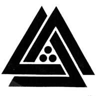
Thomas H. Geismar of the New York design firm Chermayeff and Geismar Associates, Inc. created the symbol. It consisted of three V-shaped or chevron elements arranged into two interlocking triangles with three circular elements in a floral pattern in the middle. Hartzog noted, “In its literal aspect, the symbol represents the three categories of parks—natural, historical, and recreational—that make up the work of the National Park Service. The fact that the design implies, as has been suggested, mountains, or fortifications, or tents, comes as a bonus to our original hopes for a new symbol to identify our new program.”
In a July 10, 1967, memo about the availability of NPS jewelry, Hartzog wrote, "Incidentally, you will be interested in knowing that the three circular elements within the triangular center of the design represent the international symbol for antiquities, as shown by the latest volume of the National Geographic Society." Although apparently coincidental, it is also interesting to note that this configuration of three dots, placed inside a triangle, has been a Masonic abbreviation for a title since 1774. For Park Service employees, the pattern quickly came to be seen as a stack of cannon balls.
The Parkscape U.S.A. program—and its new symbol—was launched during the NPS 50th anniversary year. The anniversary film, called “Parkscape U.S.A.,” was shown at national parks and historic sites around the country. The exhibition “Parkscapes of America” was displayed at the Department of the Interior (DOI) in Washington, DC. The Parkscape symbol was printed on the 50th anniversary poster, which was featured on about 50,000 mail trucks. The program was also highlighted in National Geographic Magazine, reaching 10 million readers.
The US Postal Service issued an anniversary stamp, also designed by Geismar, featuring the Parkscape U.S.A. symbol on a vivid yellow background. At the upper left appears “National Park Service 1916-1966” in black. At the upper right is “5c U.S.” also in black. The print order was 117 million. The first day of issue ceremony was held at Yellowstone National Park on August 25. At least four special “first day covers” (decorative envelopes with the stamp and postmark) were also created to mark the NPS anniversary. Two envelope designs feature the Parkscape USA symbol.

The symbol was intended to supplement, rather than replace, the NPS Arrowhead. As Hartzog prescribed it, it would appear on planning and presentation documents related to new area proposals; signs for beautification, historic structure rehabilitation, and new construction projects; films and audiovisual programs; exhibits; and publications and other materials that communicated NPS conservation programs.
It had a prominent position in the title of the National Park Courier, the employee newsletter. Optional “tie tacks and tasteful souvenirs” would be available for employees who wanted them. The NPS issued guidelines to ensure the symbol was applied properly and created press kits.
The design community raved about the Parkscape symbol. It was even included in the American Institute of Graphic Arts exhibit of the 50 best trademarks of the time. Within the NPS, however, it was not as well received.
Back to the Drawing Board
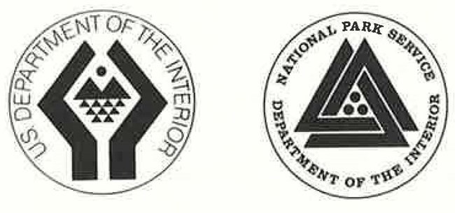
In 1968, the Secretary of the Interior removed the bison from the DOI seal in favor of a new design also created by Geismar. Following suit, Hartzog felt that the NPS Arrowhead with its bison was no longer relevant. The Arrowhead had been approved for use on July 20, 1951, becoming the official insignia of the NPS on March 7, 1962.
On April 26, 1968, Hartzog requested and received approval from the Secretary of the Interior for the Parkscape U.S.A. symbol to become the official insignia. With some additions, it became the “National Park Service Symbol” on October 10, 1968. The Federal Register notice pointed out that the NPS Arrowhead would continue to be used in “certain circumstances for an indefinite period.”
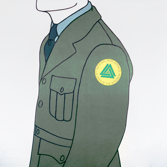
Hartzog asked Chermayeff and Geismar Associates, Inc., to prepare designs using the new NPS symbol and the DOI seal on NPS uniforms and vehicles such as cars, vans, and boats.
Three options for round sleeve patches to replace the Arrowhead patch were created. One featured bright green triangles and circles on a field of yellow, similar to the postage stamp. The other two had yellow triangles and circles on either a green or dark blue field. The two options suggested for sleeve patches were the NPS Symbol and the Parkscape symbol without the additional lettering of the NPS Symbol.
Another design board featured the Parkscape U.S.A. symbol on a ball cap with the DOI seal used as the ranger badge. On April 26, 1968 Hartzog proposed using the seal to replace the eagle design on the NPS badge at that time. Instead of the round badge depicted on the design board, when implemented the seal was placed in the middle of a shield-shaped badge.
Hartzog recognized that many employees had a “deep affection” for the Arrowhead and addressed the issue directly in the May 9, 1968, Newsletter in a special message to employees who associated it “with pleasurable days of field service.” Noting that “our attachment to it is primarily an emotional one and we are hesitant to let go of the old to grasp the new,” Hartzog recalled the resistance by many to adopt the Arrowhead just 17 years earlier.
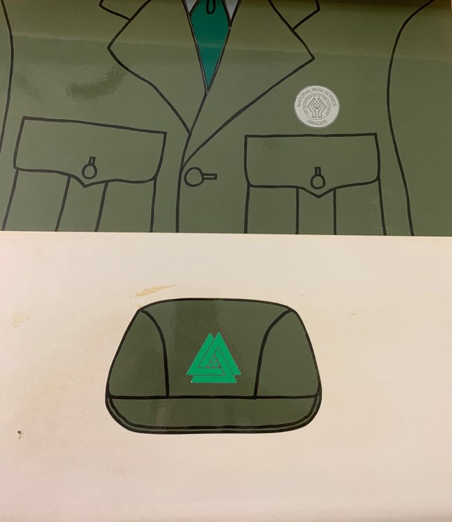
Hartzog laid out his case that the Parkscape symbol better reflected all three aspects of national parks—natural, historical, and recreational—as well as the expanding role of the NPS in historic preservation following enactment of the National Historic Preservation Act in 1966 and the interconnectedness of federal, state, and local governments and private organizations necessary “to insure the preservation of the environment of man.”
Most employees remained unconvinced and staunchly loyal to the Arrowhead. Some referred to the Parkscape symbol as the “billiard balls and rack” design.
In February 1969 Hartzog appointed a committee to “evaluate and act upon suggestions from the field concerning my proposals for one standard uniform, one color for all mobile equipment, and the abolishment of administrative handbooks and manuals.” The three recommendations related to the uniform were to reinstate the Arrowhead as the official emblem, retain the Arrowhead shoulder patch, and limit the Parkscape symbol to use as the official tie tack or pin. Hartzog approved these suggestions on May 15, 1969.


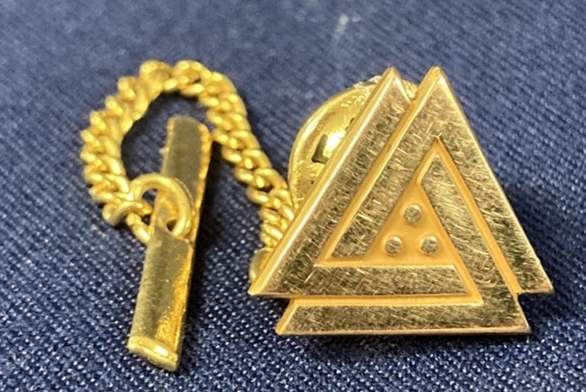
Hartzog’s decision reversed course before the June 1, 1969, date to remove the Arrowhead patch from uniform sleeves. It’s unlikely that the Parkscape patches went into widescale production. The ranger badges featuring the DOI seal continued to be used until 1970. Gold, silver, and enamel green versions of the tie tack continued to be part of the official NPS uniform until 1974.
Sources:
--(1966, May13). “Park Service Sees Changes in Its Role” The Sacramento Bee (Sacramento, California), p. 86.
--(1966, July 14). “National Park Service Marks Golden Year with Exciting Plan—Parkscape U.S.A.” The News (Patterson, New Jersey), p. 29.
--(1968, October 22). “National Park Service Insignia.” Federal Register, Vol. 33, No 206.
--“Parkscape” folders, NPS History Collection, HFCA 1645, Series I.
Sellars, Richard West. (1997). Preserving Nature in the National Parks: A History. Yale University Press.
United States Congress. (1966). House Committee on Appropriations, Subcommittee on Department of Interior and Related Agencies. Washington, DC.
United States Department of Interior. (1965). “Man—An Endangered Species?” United States Department of the Interior Conservation Yearbook 4, p.26.
Workman, R. Bryce. (1991). National Park Service Uniforms: Badges and Insignia 1894-1991. National Park Service, Harpers Ferry Center.
Workman, R. Bryce. (1998). National Park Service Uniforms: The Developing Years 1932-1970. National Park Service, Harpers Ferry Center.
