Park Tiles Standard road revision, November 2023
Published on: Tue Nov 14 2023
by Jake Coolidge, Web Cartographer
Recently we’ve investigated how to boost the contrast of roads against the light background colors of Park Tiles Standard. In recent years we’ve used the colors yellow, white, and off-white to indicate descending road hierarchy from grade-separated expressways down to service roads, coupled with slightly darker casing to boost figure/ground contrast. But even with the use of casing, we’ve encountered difficulty maintaining an appropriate amount of contrast that works in both rural and urban areas. This was particularly an issue at small scales (when the map is zoomed out). Conversations with park staff prompted us to prioritize a revision of road symbols, an item that had been waiting on our design backlog.
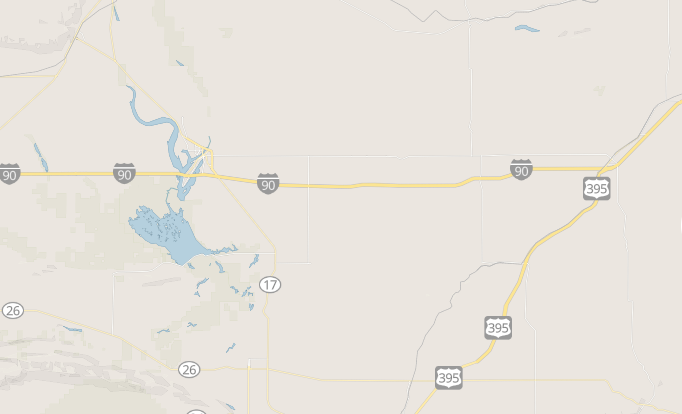
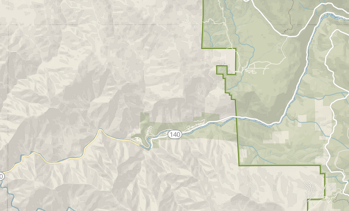
Roads displayed with low levels of contrast in rural areas prior to the update to Park Tiles
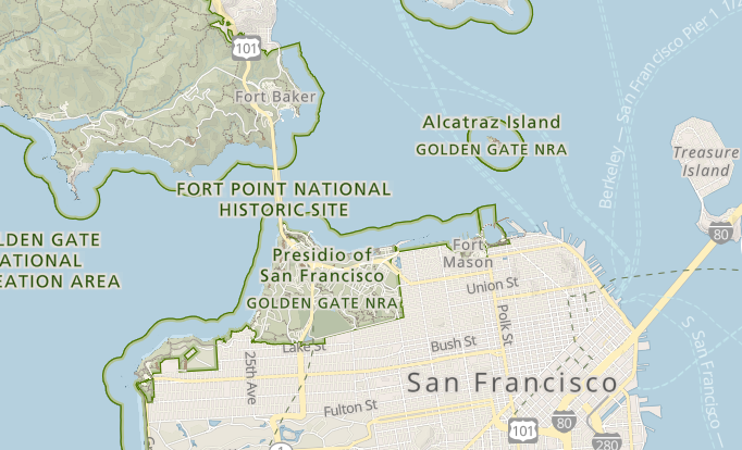
One of the features of the previous road symbolization scheme was that they did not overwhelm the map in dense urban areas
The problem originates with light road colors on a light background with a very thin and slightly darker casing serving as an intermediary. Boost the visibility of the casing, and the roads become more visible, but also with a messy, stripe-like appearance that causes some visual vibration at low zooms. The solution is to give roads slightly darker colors that need little or no casing to stand out from a variety of background colors. Major roads are slightly darker than the rest of the network. Aside from that, hiearchy is indicated by line width. The roads stand out from the background nicely and also read the same for persons with color vision disabilities.
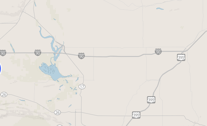
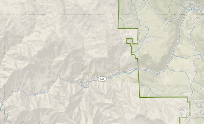
This is the same rural area shown above with the revised road symbols applied; note the improved contrast with the background
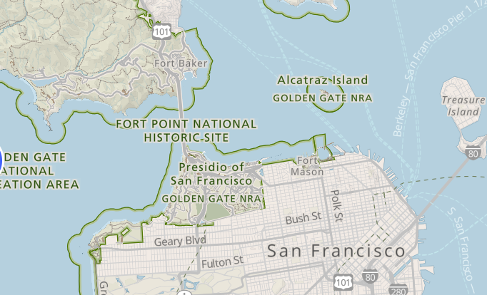
In urban areas, the revised road symbols improve contrast with the background without overwhelming the map
There is another advantage to shifting from yellow-white-off-white roads to gray roads: it smooths out discrepancies in the various data sources we use in Park Tiles. For example, a road designated a primary road in OpenStreetMap (OSM) is marked a secondary road in the NPS road dataset. The OSM-based road is superceded at the park boundary by NPS data. When this happens, the road symbol changes from yellow to white, even though the road itself does not change in any substantial way. A more uniform color scheme better approximates on-the-ground conditions.
The previous road symbol scheme drew unnecessary attention to data discrepancies between data sources, like this road classified as primary in OSM and classified as a secondary road in the NPS road dataset
The revised road symbols smooth out these discrepancies by applying a uniform gray color to a variety of road classes across both datasets.
We’ll begin by rolling out an update to Park Tiles Standard. Soon after we’ll update the Park Tiles legend to reflect these changes, and finally we’ll attend to a few variations on Park Tiles Standard we currently support: Park Tiles Standard OSM, Park Tiles Standard SL, and Park Tiles Standard SLSB.