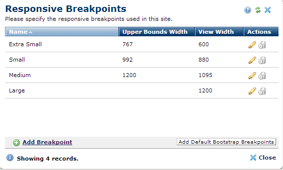
Breakpoints define the width at which content responds, or "breaks", to give visitors the best possible layout for viewing content. Each breakpoint corresponds to the display size for commonly used devices, such as cell phones, tablets, laptops and minis, and desktops. Use this dialog to enter the breakpoints for the grid system that your site uses. The breakpoints you enter here control display width for previewing content for multiple devices. See the description of View menu options in the Contributors Reference.
This dialog displays the following columns. Click to sort by column head.
Click the edit icon  in the Actions column to view or change any individual breakpoint, or remove individual breakpoints by clicking the associated delete icon
  .
.
Click Add Breakpoint to include another device-specific breakpoint in the breakpoint set.
Related Links
You can download PDF versions of the Content Contributor's, Administrator's, and Elements Reference documents from the support section of paperthin.com (requires login).
For technical support:
