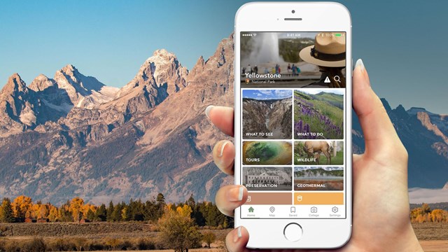
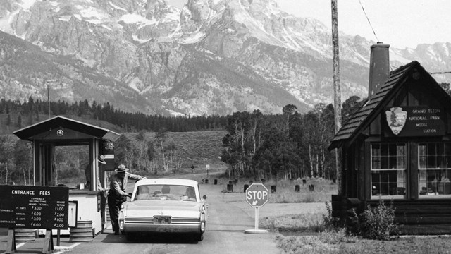
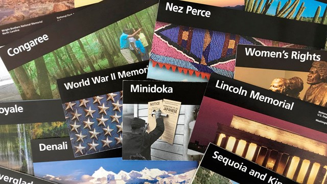
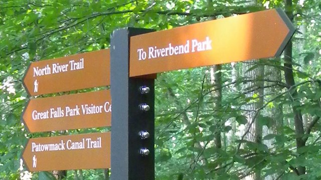
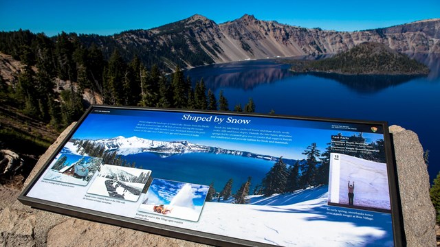
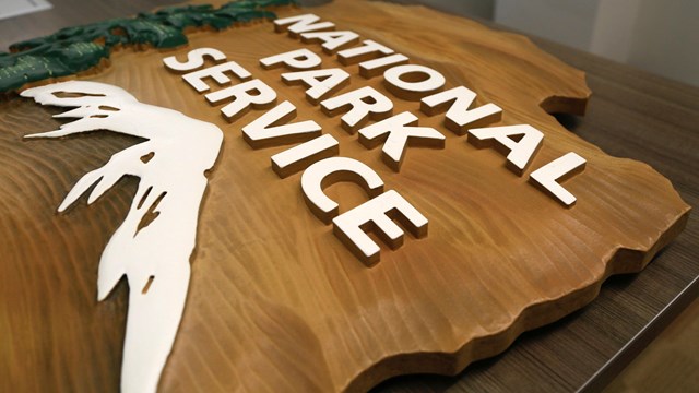
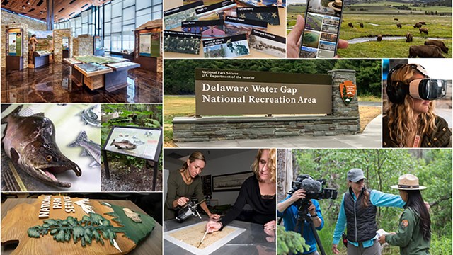
Inspiring Visitors through Interpretive Media
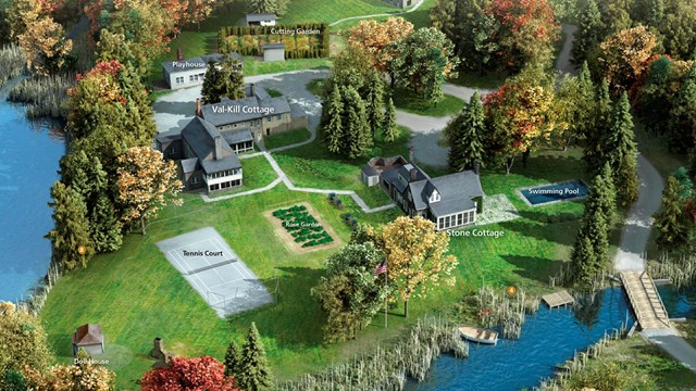
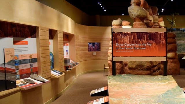
At the Harpers Ferry Center for Media Services, we are committed to enhancing visitor experiences through the use of relevant, compelling media. By offering products and services that reach across disciplines, we help parks shape visitors’ experiences from the moment they choose to visit.
For more than 50 years, we have delivered high-quality media that:
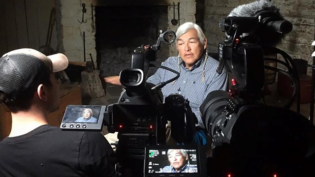
- Is designed by leading experts
- Features innovative solutions
- Aligns with the NPS brand and vision
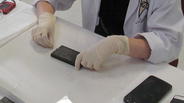
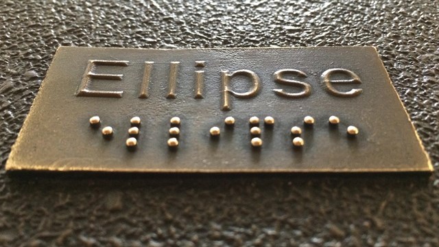
- Integrates accessibility from the very beginning
- Offers scalable solutions