You are here: Administrators Reference > Site Administration > Responsive Design

Responsive Design

In an increasingly mobile world, with an increasingly diverse number of mobile devices, making your website mobile-friendly is of utmost importance. The best approach is to implement a responsive design that will ensure your website can be viewed from any device, with any size screen. Google itself says the following in its webmasters guide. "Google recommends webmasters follow the industry best practice of using responsive web design, namely serving the same HTML for all devices and using only CSS media queries to decide the rendering on each device,"

CommonSpot's responsive design features were developed to support the most popular HTML, CSS, and JavaScript frameworks for mobile-first development, allowing site designers to implement a fluid responsive grid system that responds to each visitor’s viewing device.

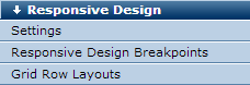
Site administrators and site designers can set up and configure CommonSpot’s responsive design features from the Responsive Design section of the accordion menu in Site Administration.

Bootstrap and other frameworks use a fluid grid system that appropriately scales the number of columns in the grid as device or viewport size changes. Grid systems use a series of rows and columns to house content and provide predefined CSS classes to control how rows and columns render.

Before creating or modifying pages for multi-device consumption, you should have experience adding, using, and modifying styles and a basic understanding of responsive design principles.

CommonSpot includes native support for Bootstrap grid row breakpoints to simplify breakpoint management, as well as features for easily creating grid row layouts and adding them to pages and templates.

Setting Up Your Site for Responsive Design

Configuring your environment for responsive layouts is a multi-step process of:

  1. Loading Bootstrap or other ready-to-use or custom framework. You need to ensure that the CSS resources of your responsive framework are loaded onto the page. You can do this by registering the resources in CommonSpot and then loading them in your base template or other template as appropriate. See Site Administration - Resources / Libraries - Registered Resources / Libraries and the Resources section of the Developer’s Guide.
  2. Configuring Responsive Design Settings. From Site Administration - Responsive Design, you can configure various responsive design settings in CommonSpot, including whether CommonSpot should handle the rendering of the viewport meta tag, and CSS classes specific to your responsive design library for fixed and fluid containers and grid rows.
  3. Registering the responsive breakpoints of your library. Once you register the breakpoints your responsive design uses, CommonSpot displays them in the View menu so that contributors can see and edit content appropriate to the various device sizes.

    See Site Administration - Responsive Design - Responsive Design Breakpoints.

  4. Creating grid-row layouts using the CSS classes specific to your framework. Responsive design layouts are typically made up of rows and columns. Rows can have different column width definitions, such as 100%, 50%-50%, 25%-75%, 33%-33%-33%, etc. These are called Grid Row Layouts in CommonSpot. CommonSpot features enable site designers to create sets of pre-built responsive Grid Row Layouts that contributors can choose from when configuring the layout of Container elements. CommonSpot provides an interface for defining the Grid Row Layouts you want to support, the number of columns to render for the row, and the appropriate CSS classes for each row and column. See Manage Grid Row Layouts.
  5. Creating layouts and templates using grid styles. As you build your site’s soft templates, you can use the previously defined Grid Row Layouts to format content for responsive delivery.

Grid Row Layouts

By default if no Grid Row Layout is defined, CommonSpot render the Basic Grid Row Layout.


Related Links

Responsive Design Settings

Responsive Design Breakpoints

Add Responsive Breakpoint

Manage Grid Row Layouts

Manage Grid Row Columns

Add Grid Row Layout

Choose Styles

Add Grid Row Column


You can download PDF versions of the Content Contributor's, Administrator's, and Elements Reference documents from the support section of paperthin.com (requires login).


For technical support:

http://www.paperthin.com/support/