CommonSpot's responsive design features were developed to support the most popular HTML, CSS, and JavaScript frameworks for mobile-first development, allowing site designers to implement a fluid responsive grid system that responds to each visitor’s viewing device.
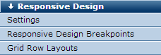
Site administrators and site designers can set up and configure responsive design settings and create responsive layouts from the Responsive Design section in Site Administration.
Contributors can select from predefined responsive layouts and drag and drop elements into responsive grid layouts to create pages for multi-device delivery.

Contributors can show/hide grid outlines within the page to easily see the rows and columns of all Container grids on the page. Grid sections are outlined in a blue dashed line when highlighting is enabled. Authors, editors and designers can also right-click to move elements within pages or templates.
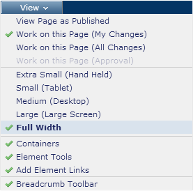
CommonSpot's native support for Bootstrap grid row breakpoints simplifies breakpoint management. Contributors can preview how pages display for various device types.
Related Links
You can download PDF versions of the Content Contributor's, Administrator's, and Elements Reference documents from the support section of paperthin.com (requires login).
For technical support:
